Zuvio
Brand Identity Design
Logo Design
UI/UX Design

Optimize business strategies with cutting-edge SaaS innovation
Zuvio is a robust SaaS platform crafted to help businesses grow, adapt, and succeed in today’s competitive environment. With features like real-time analytics, seamless integrations, and scalable dashboards, Zuvio enables users to streamline their operations with confidence. From startups to enterprises, Zuvio ensures teams stay aligned and informed every step of the way.


Project Goal
Deliver a data-centric platform for modern businesses with seamless scalability and high performance.
Create an intuitive interface to ensure easy access to analytics and decision-making tools.
Build a flexible system that supports real-time updates, third-party integrations, and insightful automation features.
Brand Discovery
Our journey began with understanding the heart of Zuvio: a collective of forward-thinkers redefining how businesses operate. We explored their values of simplicity, trust, and innovation to create a brand that feels both intelligent and human. Through discovery sessions, competitor analysis, and user interviews, we shaped a brand voice that’s bold yet approachable. Zuvio isn’t just a platform—it’s a partner in your growth. The result is a strategic visual identity that reflects clarity, modernity, and deep functionality.

Logo and
Identity Design

The Zuvio logo is built around the idea of forward momentum and precision—core qualities of a high-performance SaaS platform. The icon draws inspiration from directional arrows, subtly indicating progress, speed, and clarity. Its clean geometric form pairs seamlessly with the Urbanist typeface, chosen for its legibility and digital-native look. The result is a mark that is strong, scalable, and instantly recognizable in both digital and physical environments.


UI/UX Design
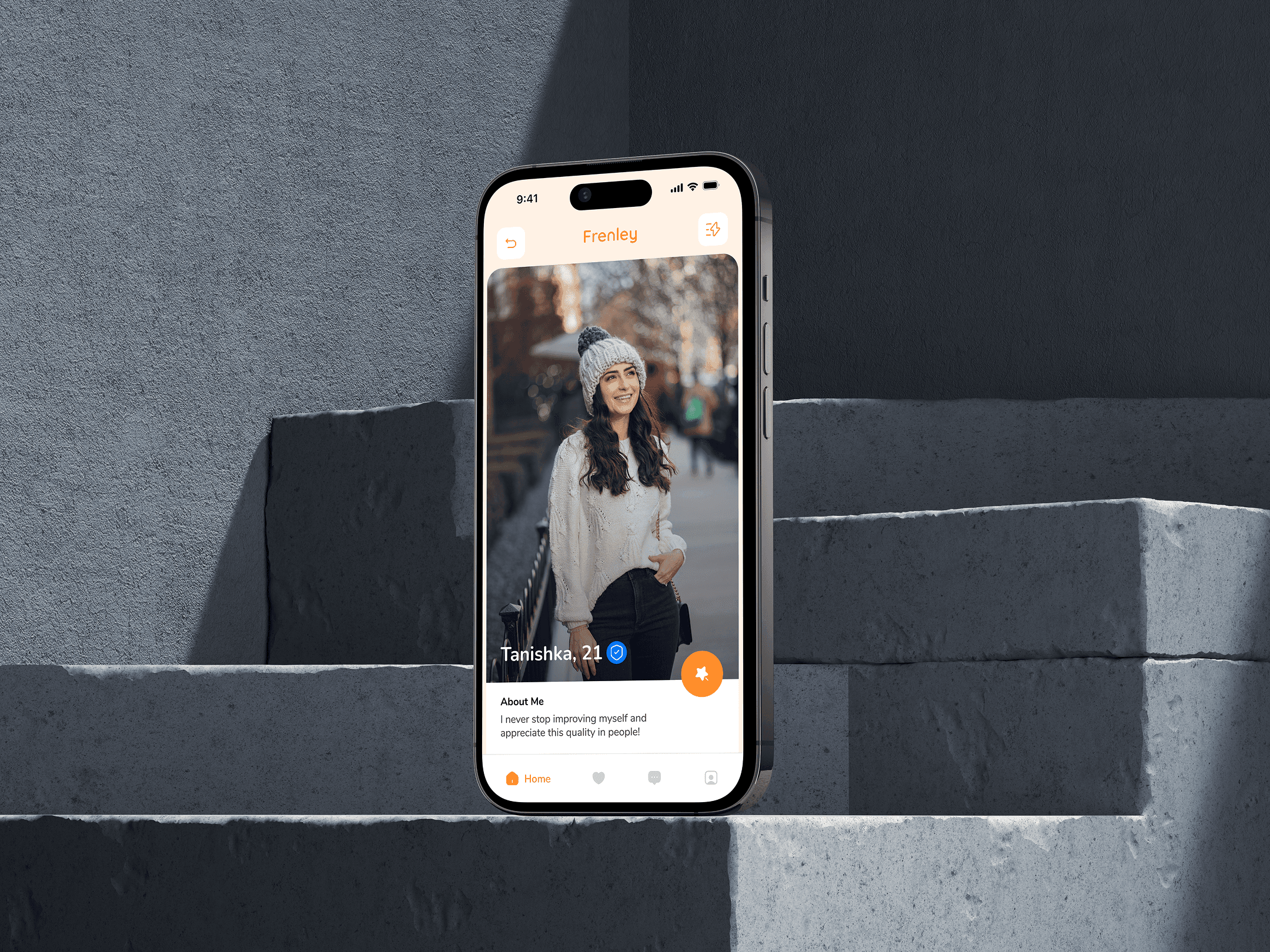
The stylescape for Frenely captures the essence of playful dating through bold visuals, vibrant colors, and a humorous tone. With a bright palette of orange and blue, quirky icons, and casual typography, the look feels young, energetic, and adventurous. It reflects the brand’s voice—fun, open, and full of good vibes. The imagery, conversational UI elements, and character illustrations together build a sense of community and modern dating culture. Everything is designed to attract singles who want more than just swipes—those looking for fun, vibes, and connection. It’s not just a style—it’s a personality in motion.


(Design Inspiration)


