Frenley
Brand Identity Design
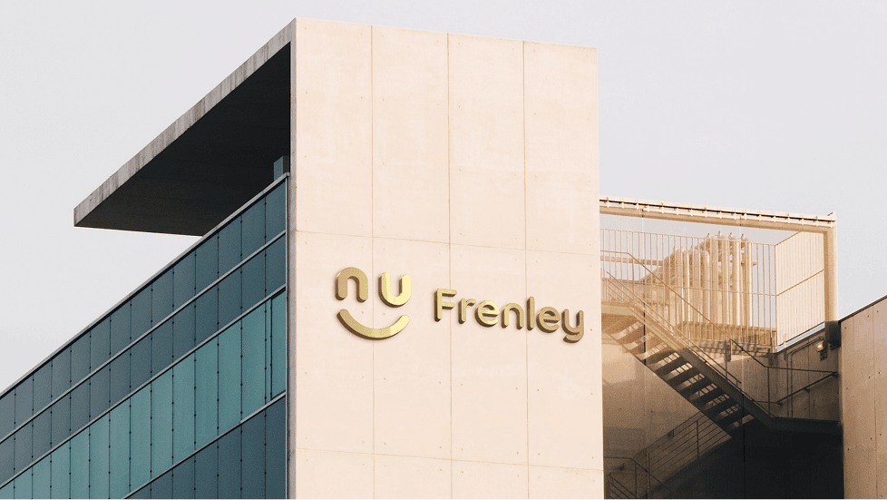
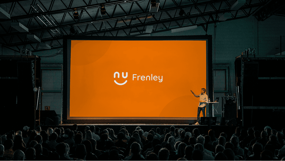
Logo Design
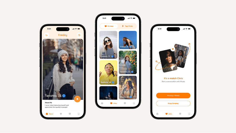
UI/UX Design
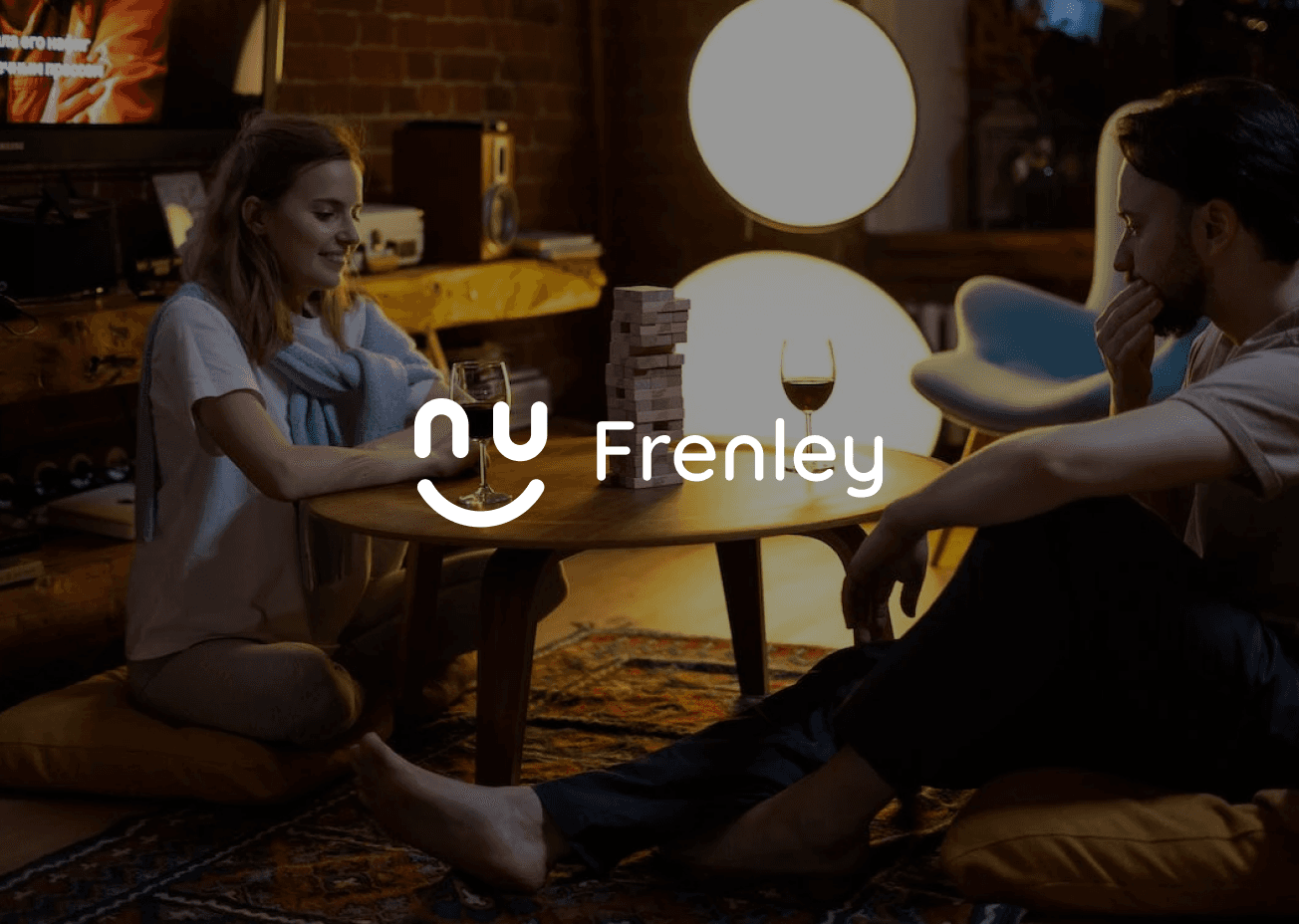
A playful dating experience built for today’s bold and open-minded singles
Frenley is built for singles who seek fun, real conversations, and zero cringe. It brings a fresh, open-culture vibe to dating—easy, adventurous, and full of personality.

Project Goal
Create a dating experience that feels light, fun, and culturally open.
Design an identity that reflects boldness, warmth, and authenticity.
Build a user-friendly app with playful interactions and seamless navigation.
Brand Discovery
Frenley was born from the idea that dating should be less awkward and more expressive. Through research and user insights, we discovered a gap in platforms that support casual yet meaningful interactions in an open and culturally fluid space. The brand needed to reflect confidence, humor, and a sense of adventure—something that resonates with today’s generation of curious, socially-aware singles. This discovery phase laid the foundation for a brand that’s not just about dating, but about celebrating human connection in a bold new way.
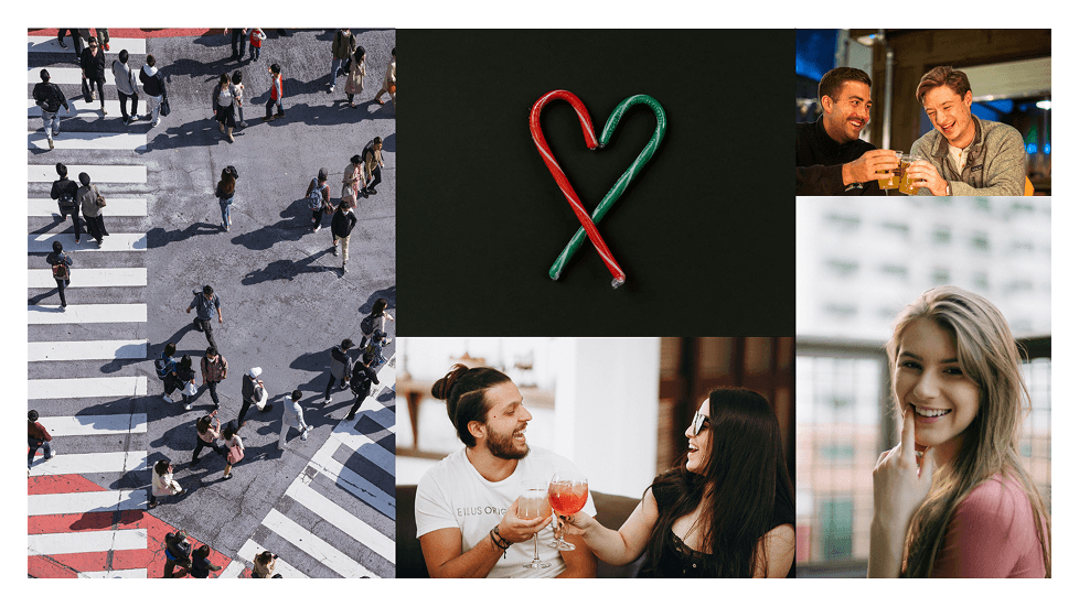
The Stylescapes
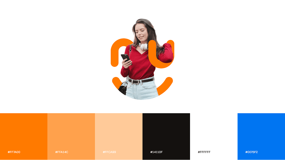
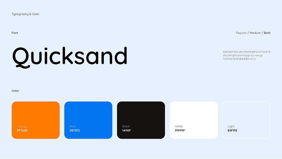
The stylescape for Frenely captures the essence of playful dating through bold visuals, vibrant colors, and a humorous tone. With a bright palette of orange and blue, quirky icons, and casual typography, the look feels young, energetic, and adventurous. It reflects the brand’s voice—fun, open, and full of good vibes. The imagery, conversational UI elements, and character illustrations together build a sense of community and modern dating culture. Everything is designed to attract singles who want more than just swipes—those looking for fun, vibes, and connection. It’s not just a style—it’s a personality in motion.
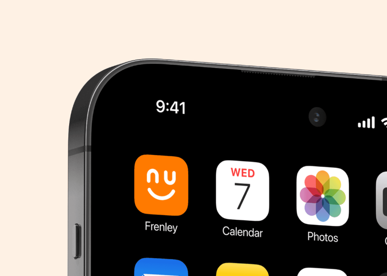
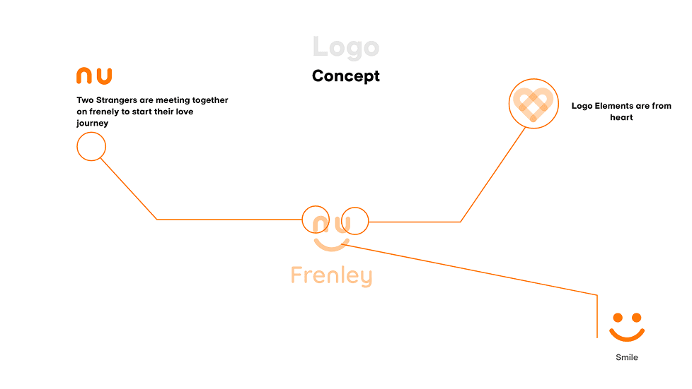
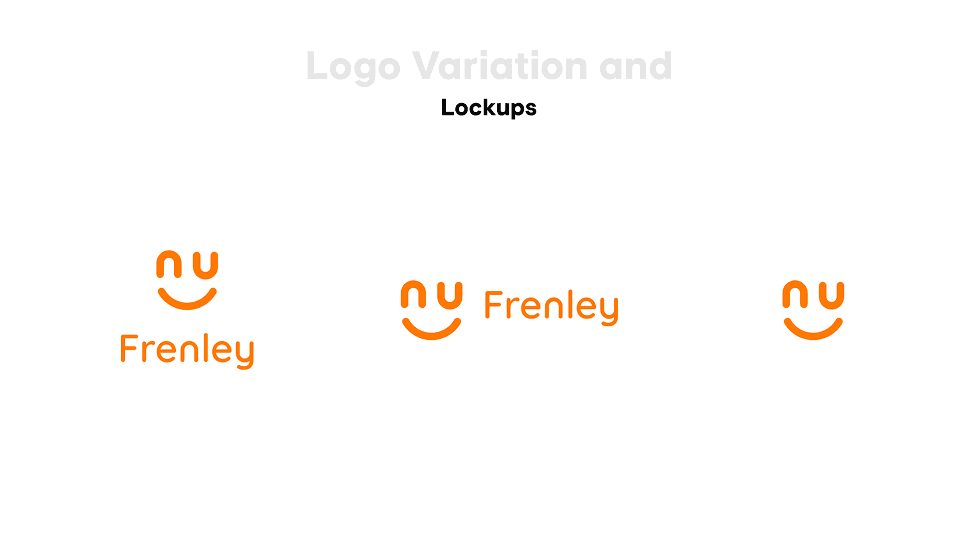
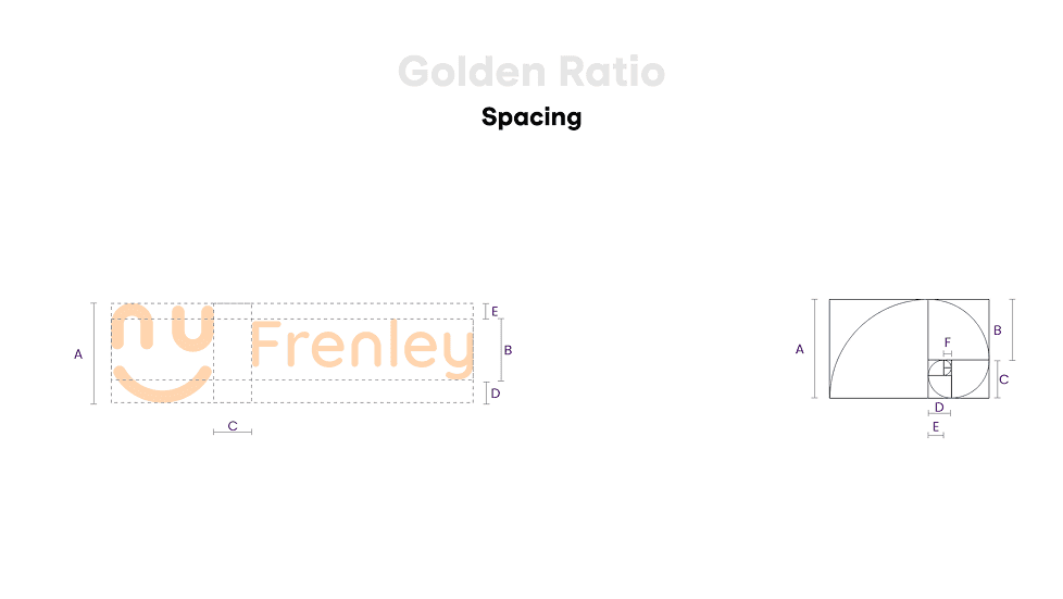
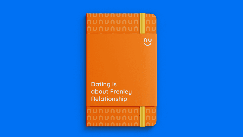
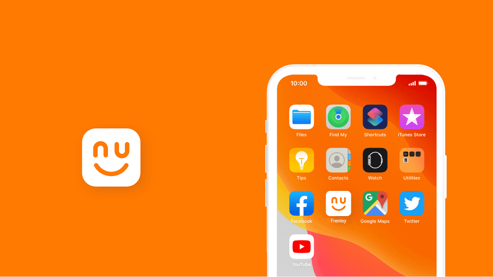
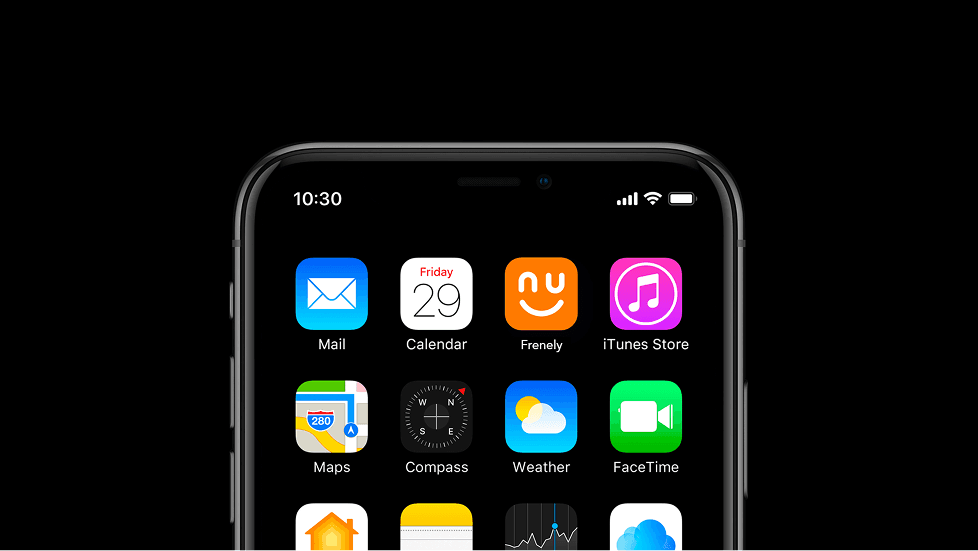
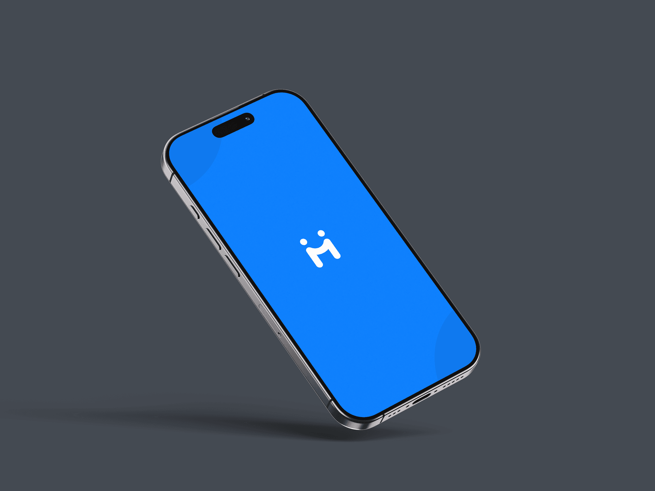
Logo and
Identity Design
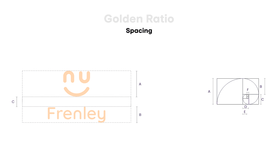
Frenely’s logo doesn’t whisper—it winks. With chunky curves and bold letterforms, it shouts playful confidence. The vibrant orange says “Let’s go!”, while the punchy blue says “Trust me, I’m fun.” It’s modern, cheeky, and impossible to ignore. Icons? Cute but clever. Layout? Minimal but full of personality. The whole identity feels like your funniest, coolest friend who dares you to text your crush. Everything’s crafted to match the app’s open culture—bold, humorous, and totally unfiltered. Frenely doesn’t just look good—it vibes. It’s not just a brand; it’s the start of your next favorite conversation.
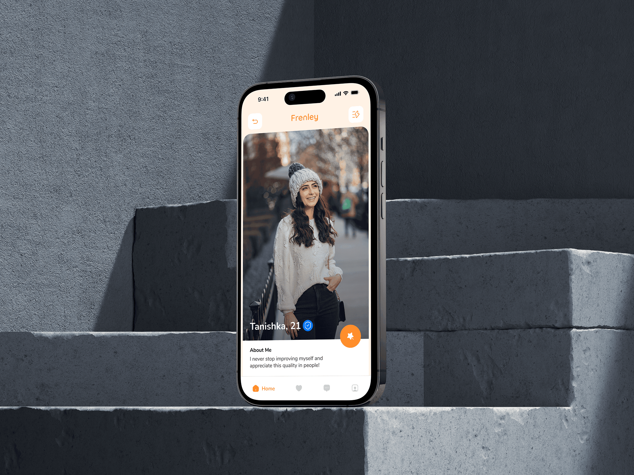
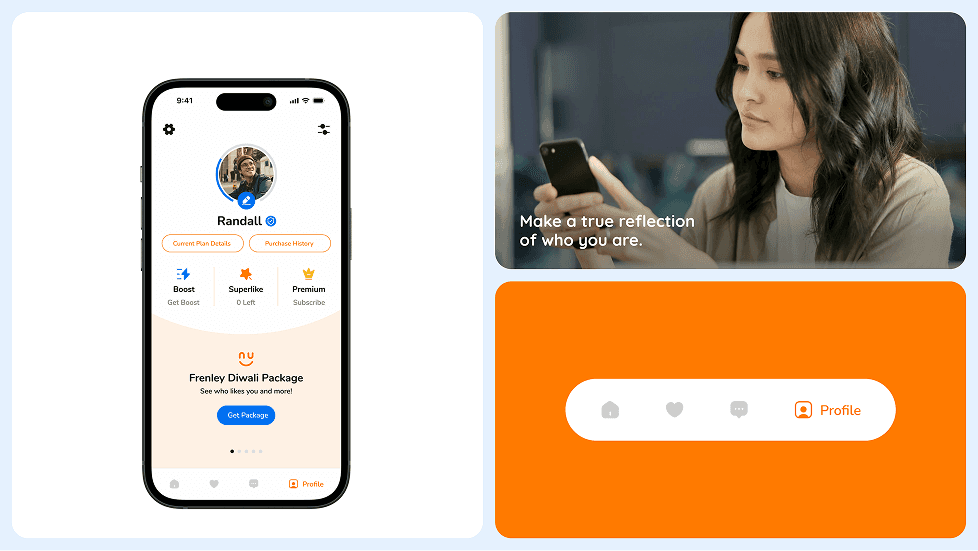
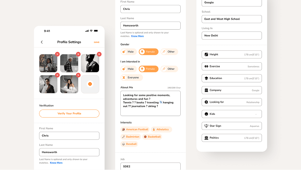
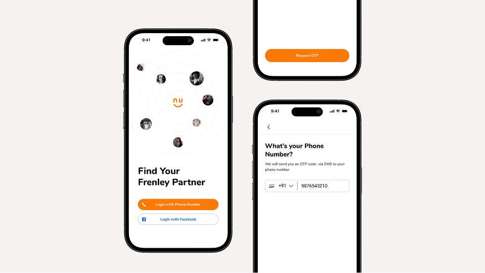
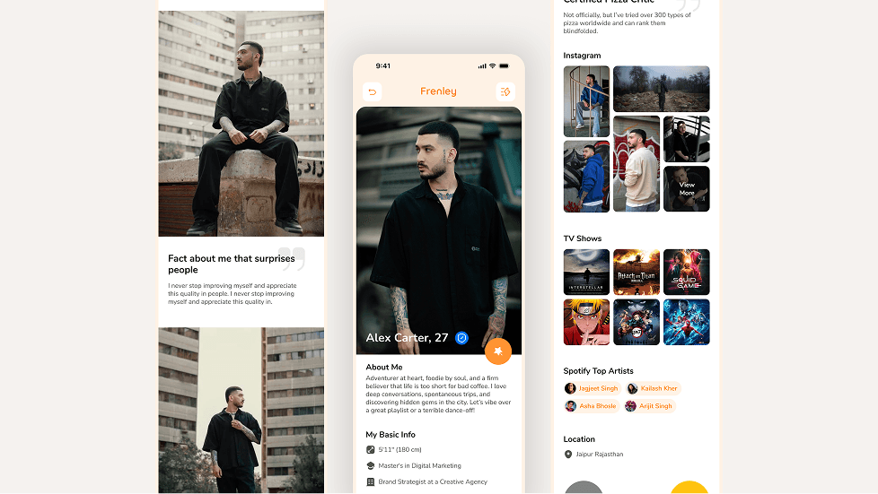
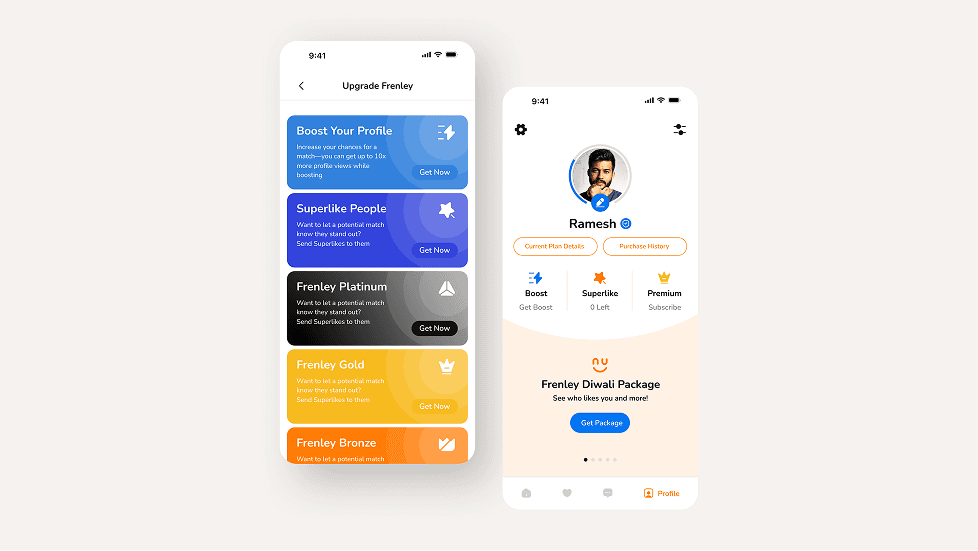
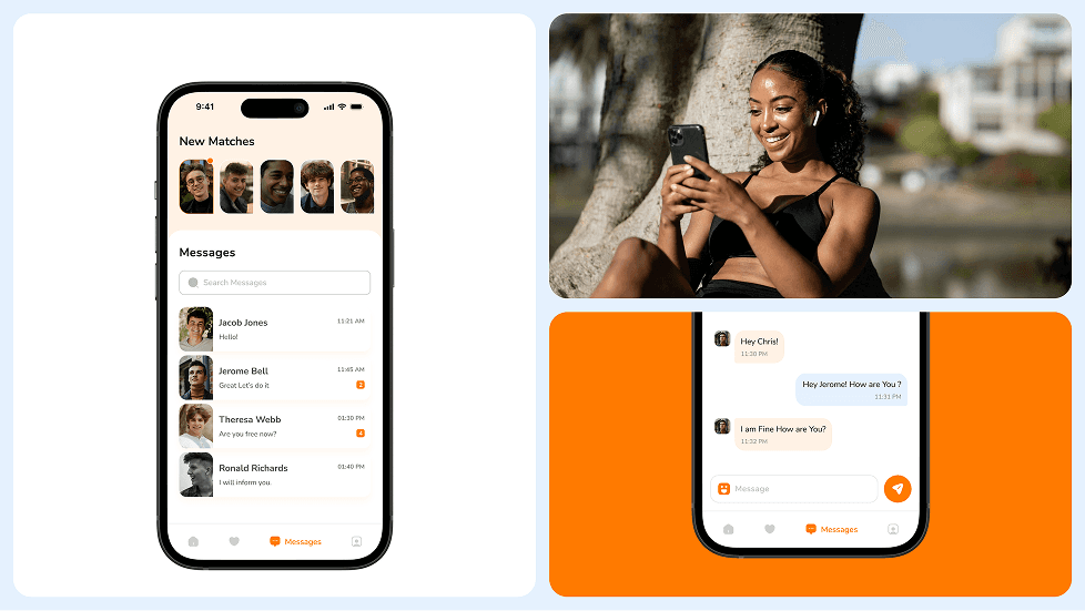
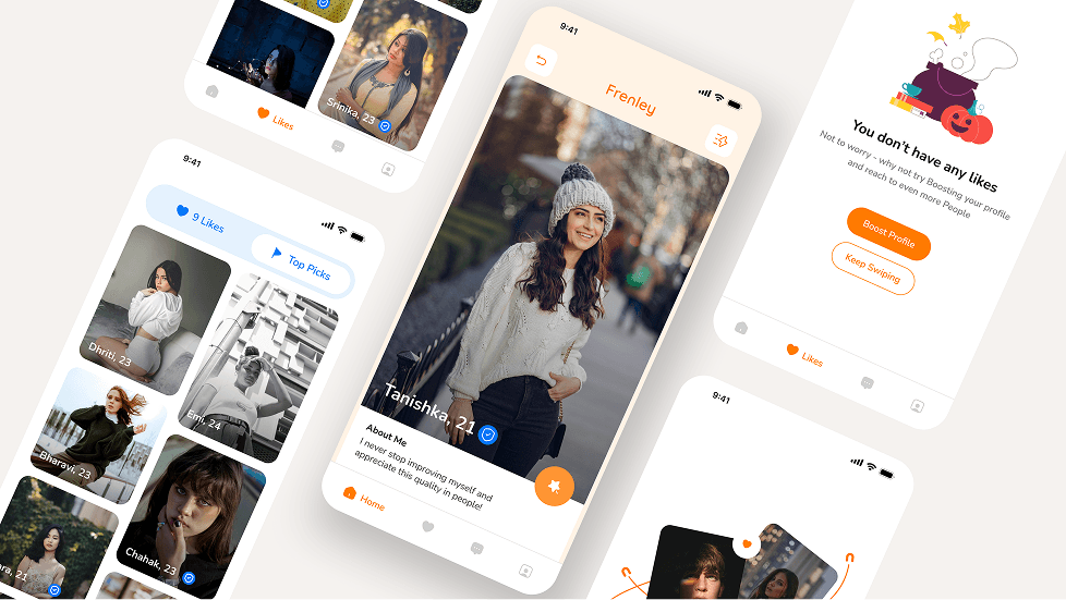
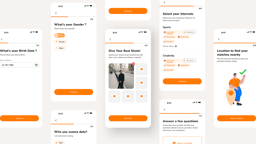
UI/UX Design
The stylescape for Frenely captures the essence of playful dating through bold visuals, vibrant colors, and a humorous tone. With a bright palette of orange and blue, quirky icons, and casual typography, the look feels young, energetic, and adventurous. It reflects the brand’s voice—fun, open, and full of good vibes. The imagery, conversational UI elements, and character illustrations together build a sense of community and modern dating culture. Everything is designed to attract singles who want more than just swipes—those looking for fun, vibes, and connection. It’s not just a style—it’s a personality in motion.
(Design Inspiration)


