Podyssey
Brand Identity Design
Logo Design
Website Design
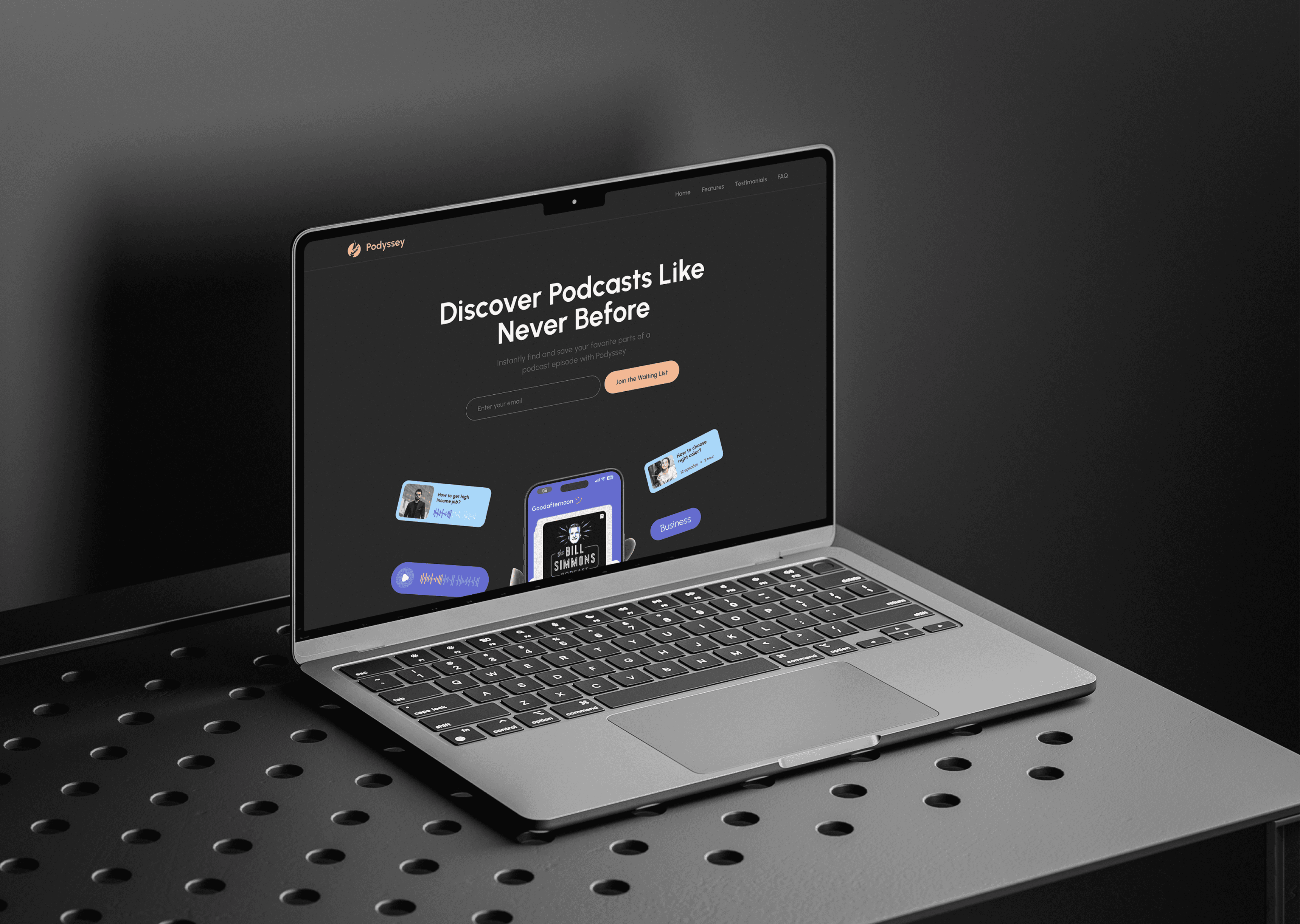
Optimize your podcast experience with Podyssey
Podyssey is designed to simplify and elevate how you discover and enjoy podcasts. With a user-focused approach, it offers quick episode summaries, personalized recommendations, and an intuitive interface — all aimed at helping you find and listen to the content you love without any hassle.


Project Goal
Simplify podcast discovery by providing quick, bite-sized episode summaries for easy content selection.
Create an intuitive, user-friendly interface that makes podcast navigation seamless and enjoyable.
Enhance user engagement through personalized recommendations based on listening habits and preferences.
Brand Discovery
Podyssey was born from the need to make podcast listening smarter and more efficient. Our brand embodies simplicity, clarity, and user empowerment. We focus on helping users save time while discovering meaningful content through technology that understands their preferences. The goal is to build trust and loyalty by creating an inviting, clean, and modern platform that feels both personal and accessible to podcast lovers everywhere.

The Stylescapes
The visual style of Podyssey combines minimalism with vibrant accents to create a fresh and engaging user experience. Clean layouts and ample white space guide users effortlessly through content, while bold typography highlights important information. The color palette balances calming neutrals with energetic pops of color to evoke both trust and excitement, reflecting the brand’s mission to make podcast discovery both easy and enjoyable.


Logo and
Identity Design

The Podyssey logo captures the spirit of discovery and storytelling through a bold, minimalist emblem. A stylized boat sailing across a circular wave represents both journey and sound — a perfect metaphor for the podcast experience. The clean sans-serif wordmark complements the icon, reflecting a modern and approachable identity. This mark is versatile across platforms and scales well for both app icons and print collateral. The identity system uses soft earthy tones, reinforcing warmth, creativity, and ease of use — values at the heart of the Podyssey brand.


UI/UX Design
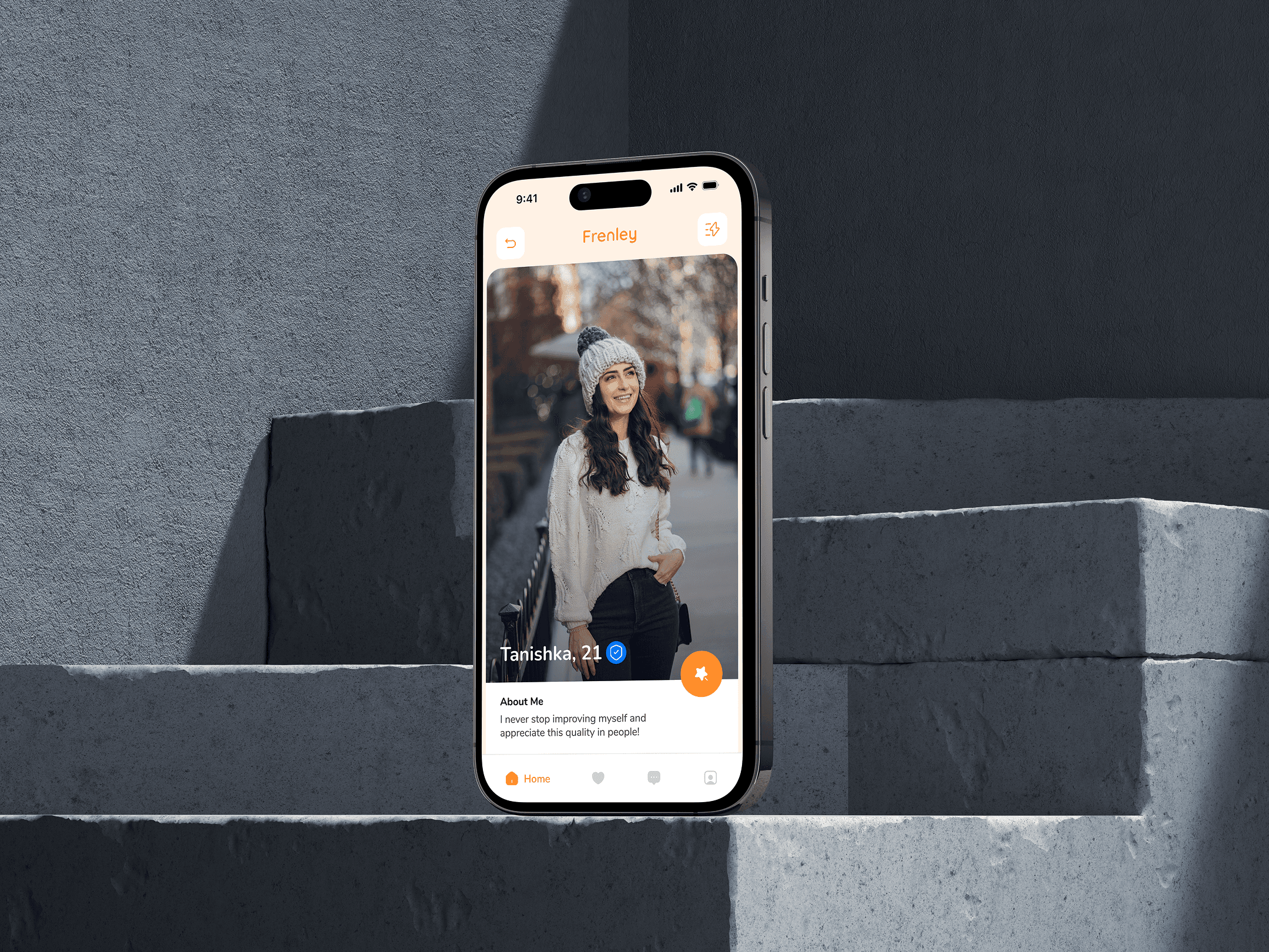
The stylescape for Frenely captures the essence of playful dating through bold visuals, vibrant colors, and a humorous tone. With a bright palette of orange and blue, quirky icons, and casual typography, the look feels young, energetic, and adventurous. It reflects the brand’s voice—fun, open, and full of good vibes. The imagery, conversational UI elements, and character illustrations together build a sense of community and modern dating culture. Everything is designed to attract singles who want more than just swipes—those looking for fun, vibes, and connection. It’s not just a style—it’s a personality in motion.


(Design Inspiration)


