Quickbill
Brand Identity Design
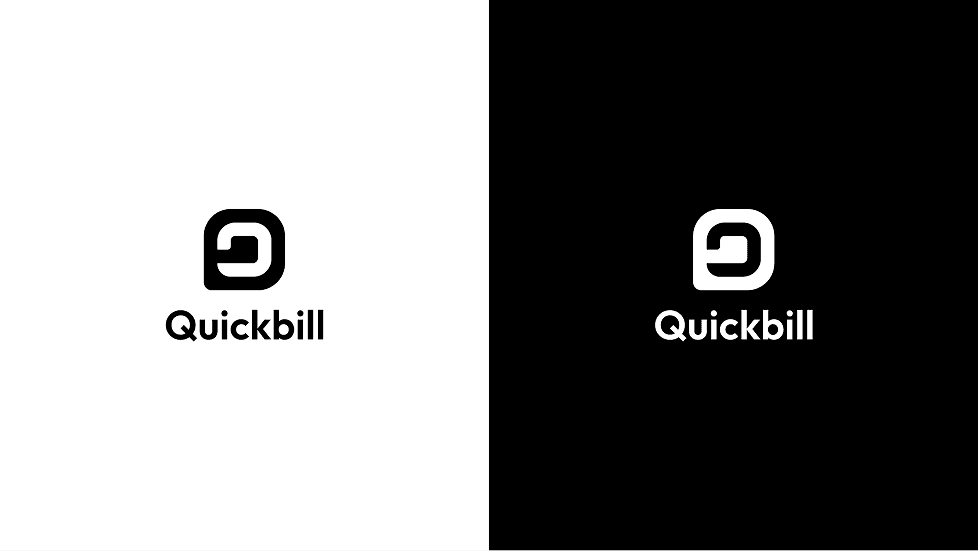
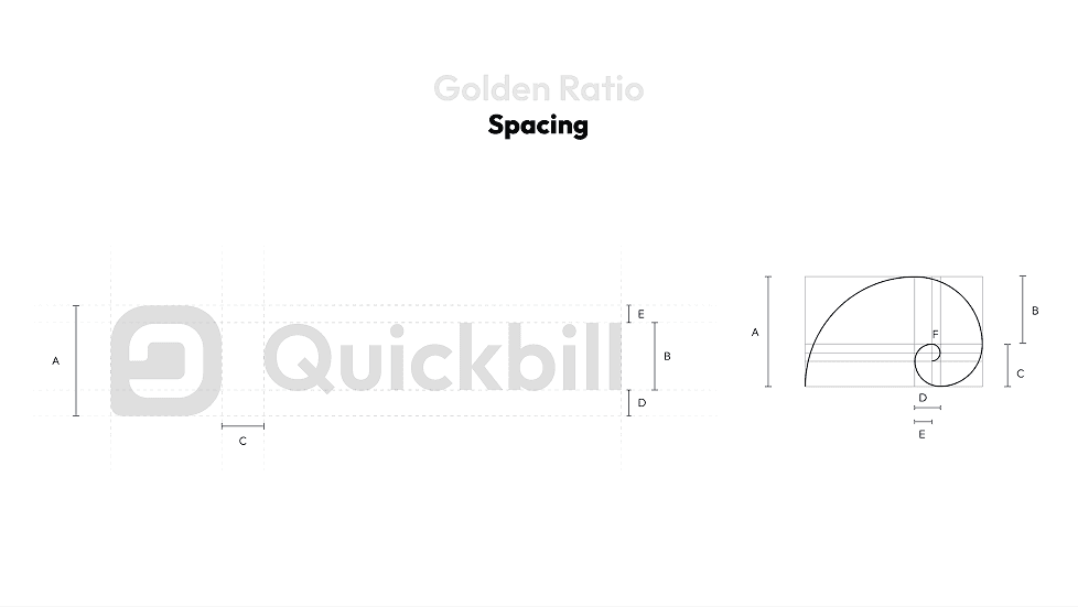
Logo Design
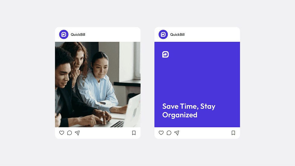
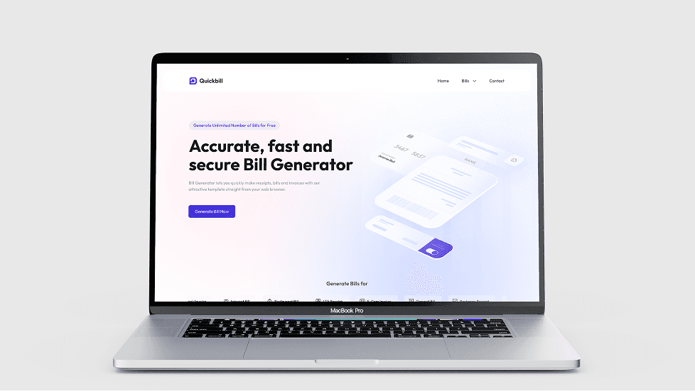
Website Design

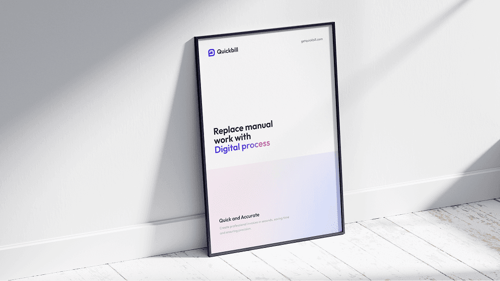
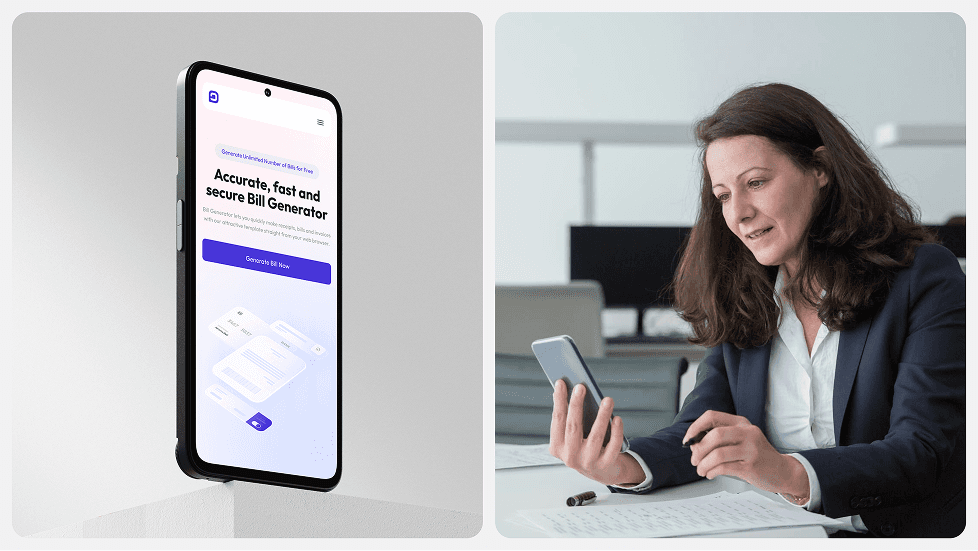
QuickBill: Fast, Reliable, Error-free Billing.
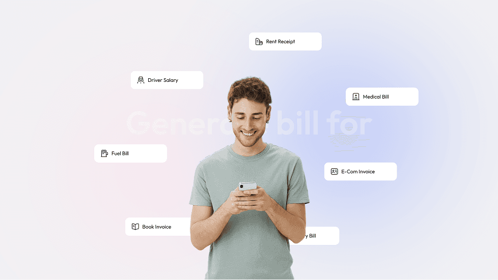
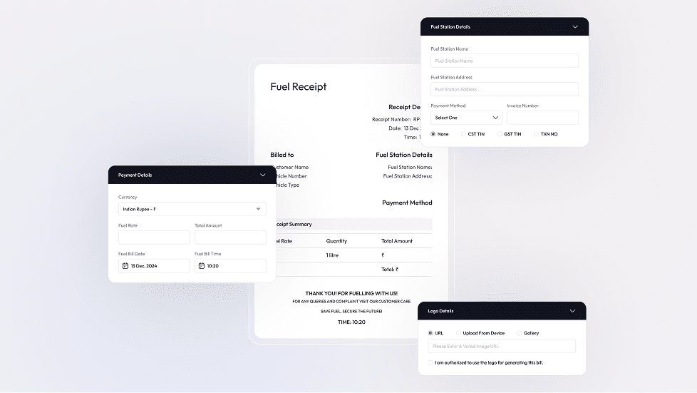
QuickBill is a professional invoice and bill generator that helps businesses, freelancers, and individuals create beautiful, accurate bills in seconds. Built for ease and speed, it simplifies documentation, enhances credibility, and saves time. Whether you're billing clients or recording transactions, QuickBill delivers with clean design and smart features.

Project Goal
Build a strong visual identity that reflects simplicity, speed, and trust.
Design an identity that reflects boldness, warmth, and authenticity.
Establish a consistent brand system that works across digital and print formats.
Brand Discovery
We began with understanding the user — from independent creators and shop owners to service-based professionals. These users needed something functional yet beautiful. They valued accuracy, quick turnaround, and professionalism in billing. We also looked at competitors and found many were either too complex or too outdated. QuickBill needed to position itself as a smart, fast, and easy alternative designed for modern use but built with trust and clarity at its core.
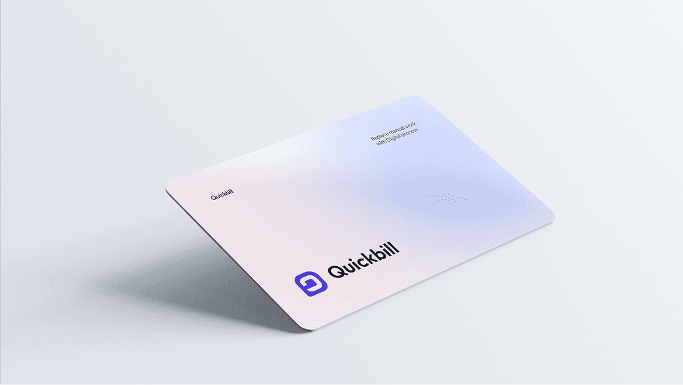
Logo and
Identity Design
The Design Daily logo captures the spirit of daily progress and creative growth. Built around a simple wordmark, the logo features a playful ellipsis (“...”) at the end — symbolizing continuity, momentum, and the idea that design is a never-ending journey. The typography is bold and rounded, making it feel approachable, friendly, and supportive — just like the platform itself. The visual identity uses a vibrant color palette with energetic tones like Majorelle Blue and Crayola Yellow to evoke creativity, trust, and motivation. These are balanced by soft, calming pastels that keep the overall look fresh and welcoming. Every visual element, from the curved letterforms to the inviting colors, is designed to reflect the brand’s mission: helping designers stay consistent, feel confident, and grow through practice.


UI/UX Design
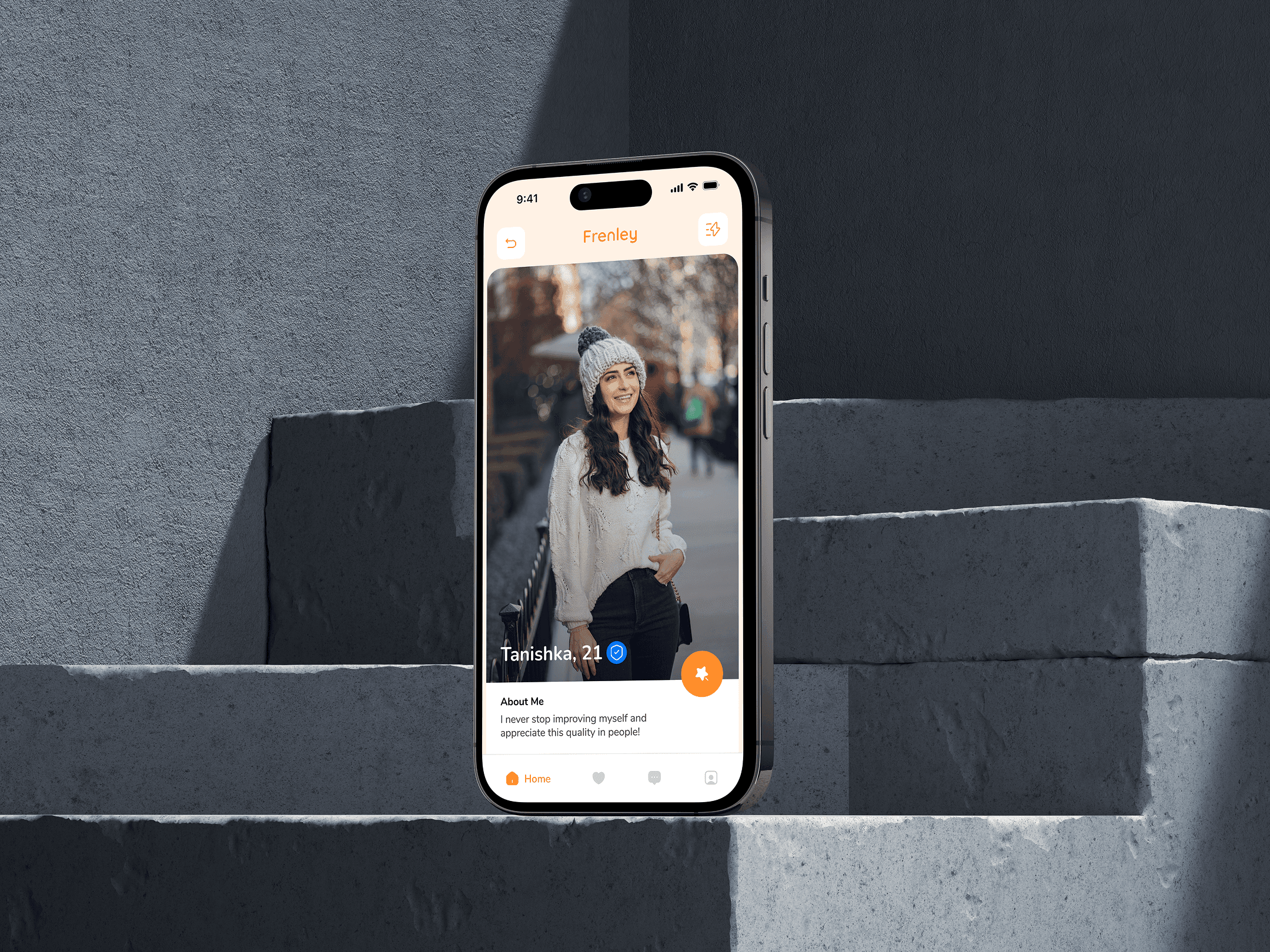
The stylescape for Frenely captures the essence of playful dating through bold visuals, vibrant colors, and a humorous tone. With a bright palette of orange and blue, quirky icons, and casual typography, the look feels young, energetic, and adventurous. It reflects the brand’s voice—fun, open, and full of good vibes. The imagery, conversational UI elements, and character illustrations together build a sense of community and modern dating culture. Everything is designed to attract singles who want more than just swipes—those looking for fun, vibes, and connection. It’s not just a style—it’s a personality in motion.


(Design Inspiration)


