Flowzen
Brand Identity Design
Logo Design
UI/UX Design

Building calm productivity through intentional design and seamless experiences.
Flowzen is a modern productivity platform designed to help individuals and teams achieve deep focus and stay aligned with their goals. With a strong emphasis on clarity, minimalism, and mindful interfaces, Flowzen blends function and form to reduce noise and encourage flow. This case study walks through our brand identity and product design journey.


Project Goal
Create a visual identity that communicates calmness, clarity, and focus.
Design a UI/UX system that supports deep work and intuitive task management.
Consistency across brand touchpoints while maintaining flexibility for future feature expansion and user needs.
Brand Discovery
We began with understanding the philosophy behind Flowzen — a fusion of “Flow” (focused productivity) and “Zen” (mindful peace). Our research explored competitor tools, user habits, and modern wellness-centric design. The aim was to develop a brand that feels trustworthy, minimal, and emotionally intelligent. From color to type to tone, everything was designed to reflect intentional calm and productivity.

Logo and
Identity Design

The Flowzen logo merges simplicity with intention. Using a custom geometric sans-serif approach, we built a wordmark that is modern, approachable, and professional. Rounded terminals in the letterforms suggest calm and friendliness, while the symmetry reflects balance and structure. The color palette includes calming blues and subtle greys, evoking trust and focus. We extended the identity into iconography, motion, and brand patterns for a complete toolkit.


UI/UX Design
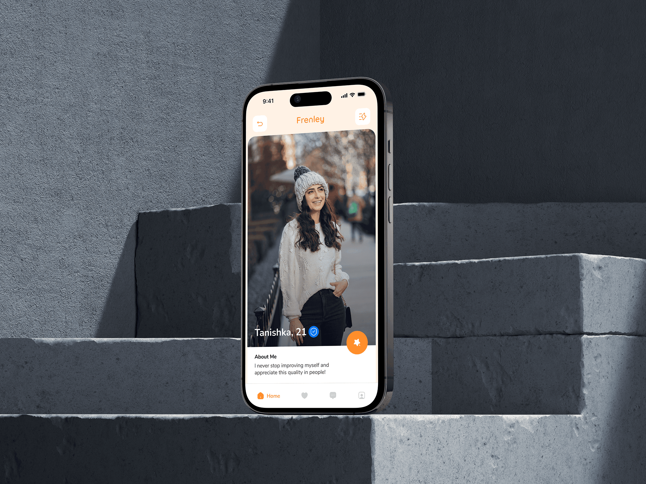
The stylescape for Frenely captures the essence of playful dating through bold visuals, vibrant colors, and a humorous tone. With a bright palette of orange and blue, quirky icons, and casual typography, the look feels young, energetic, and adventurous. It reflects the brand’s voice—fun, open, and full of good vibes. The imagery, conversational UI elements, and character illustrations together build a sense of community and modern dating culture. Everything is designed to attract singles who want more than just swipes—those looking for fun, vibes, and connection. It’s not just a style—it’s a personality in motion.


(Design Inspiration)


