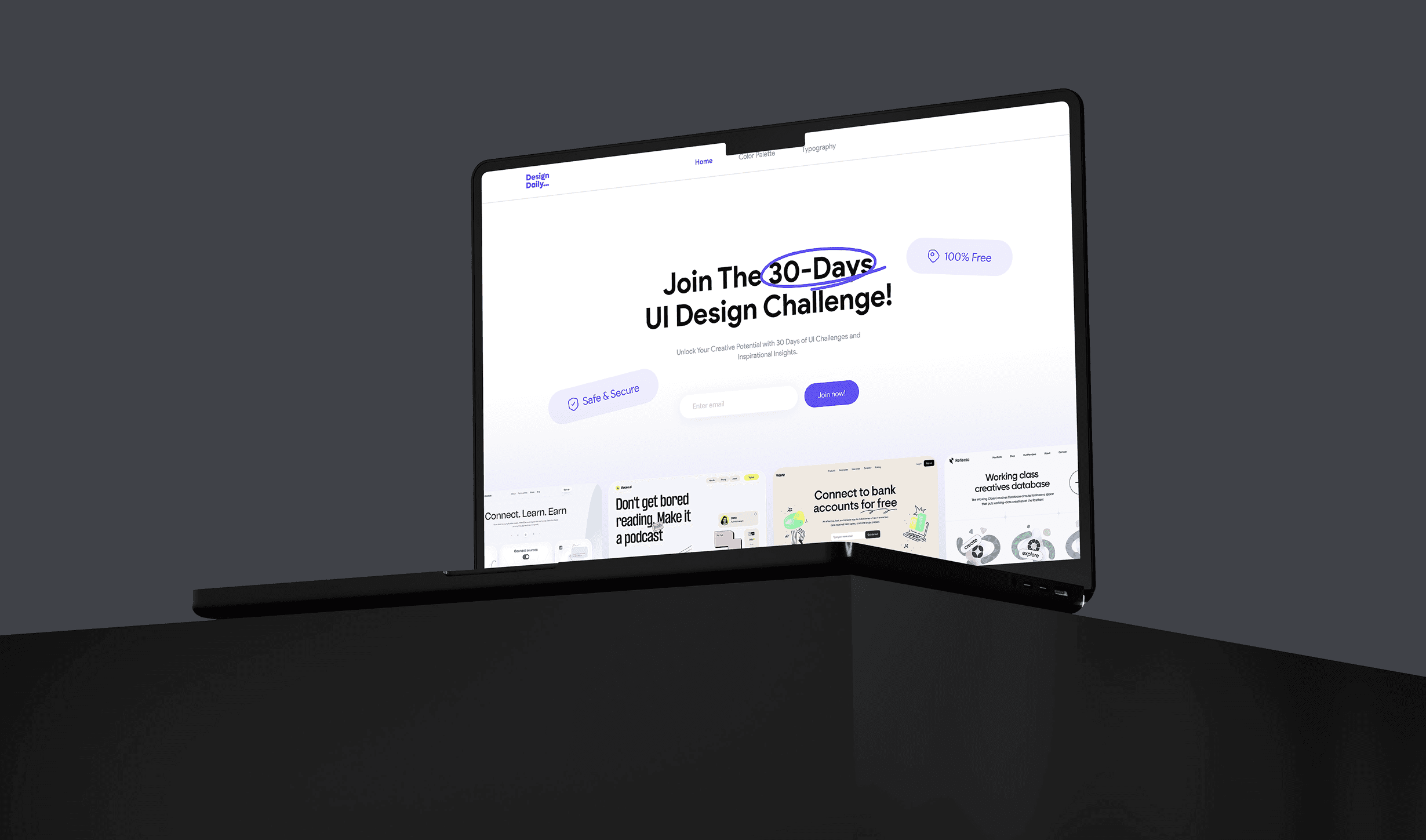
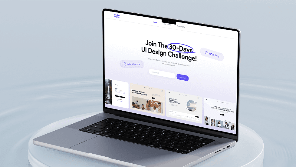
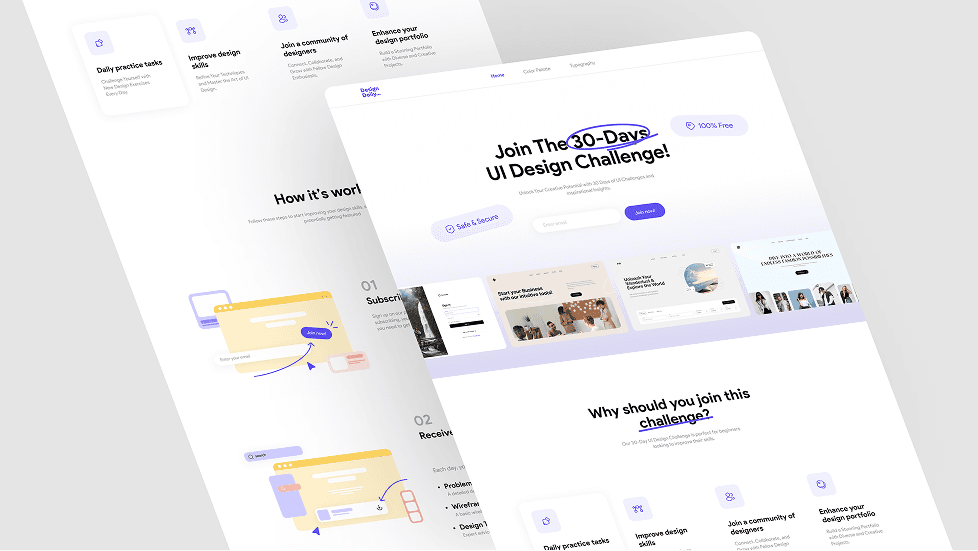
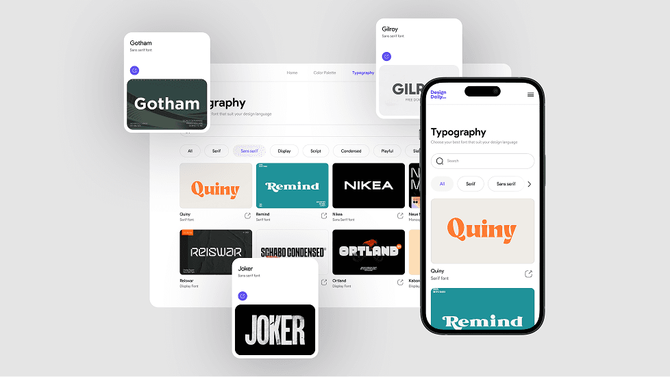
UI Design Challenge
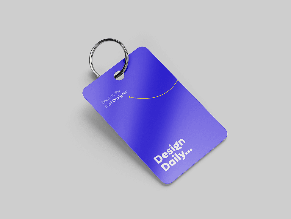
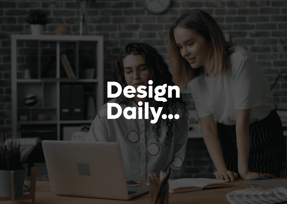
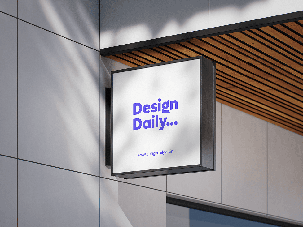
Brand Identity Design
Logo Design
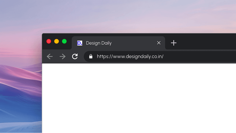
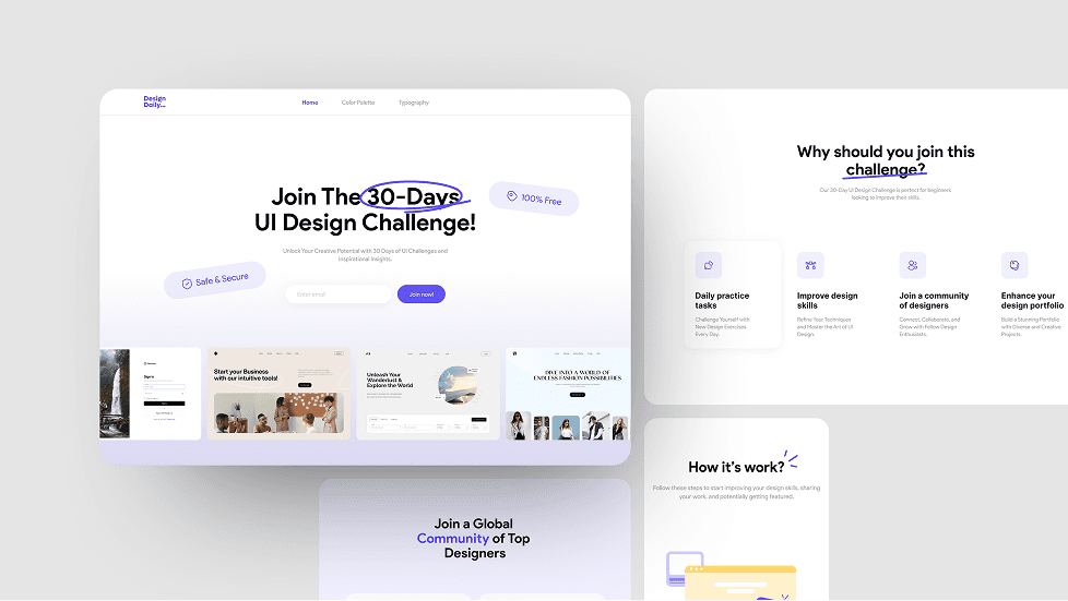
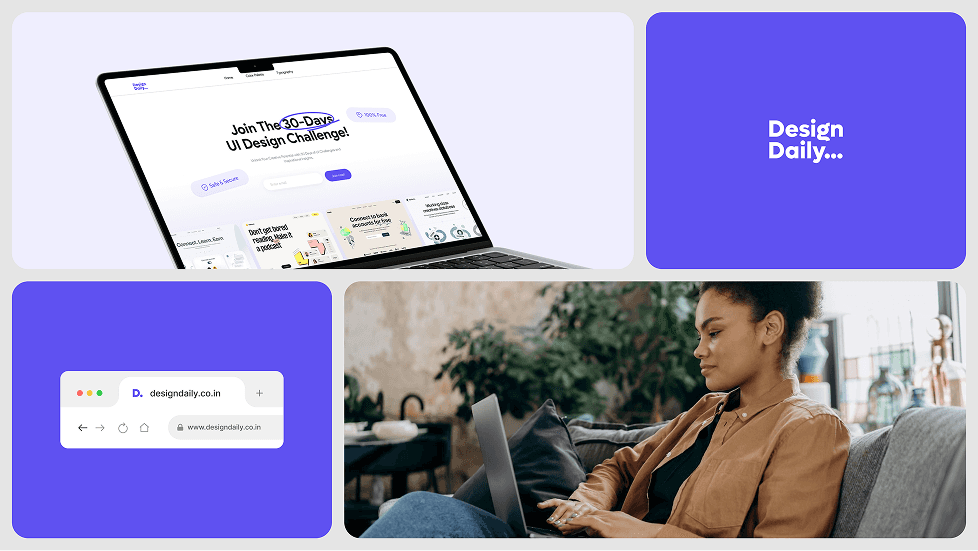
Website Design
Making Design a Daily Habit
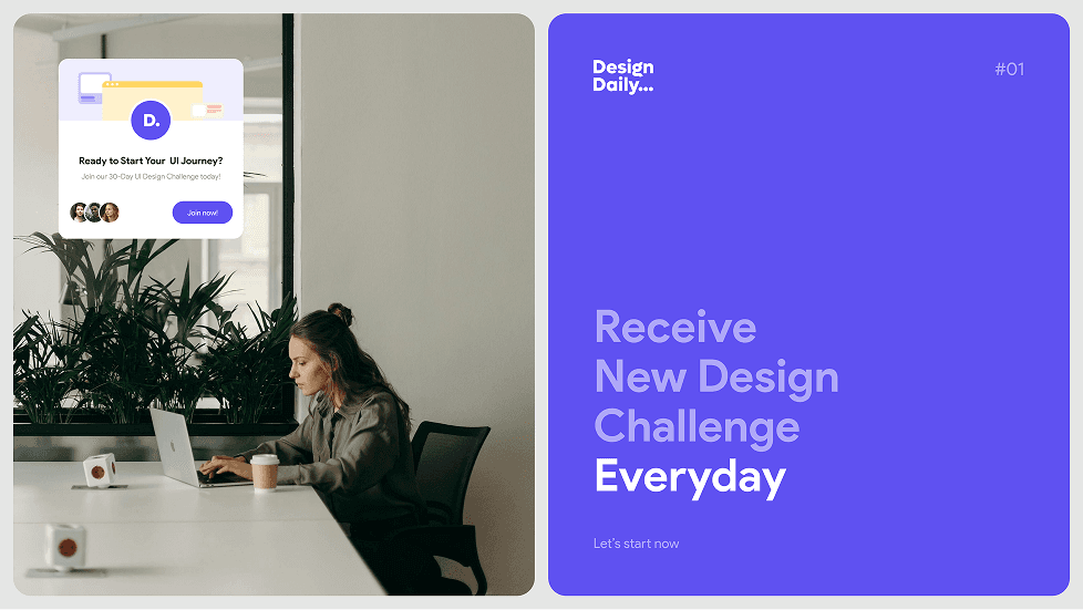
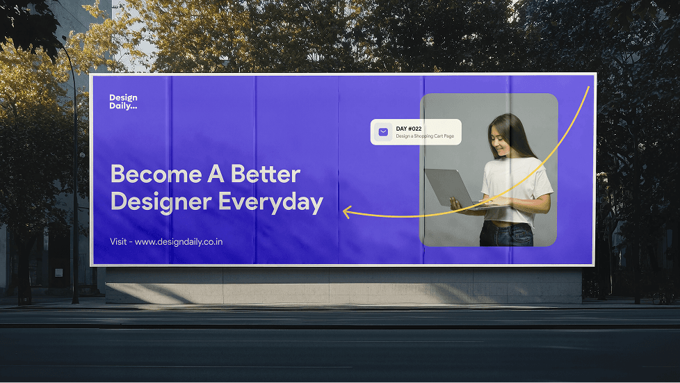
Design Daily is a platform created to help aspiring designers build confidence and consistency through daily UI design challenges. With a rise in demand for skilled UI/UX designers, many learners face a gap between theory and real-world practice. Design Daily bridges that gap by offering a structured, hands-on experience — one day at a time.

Project Goal
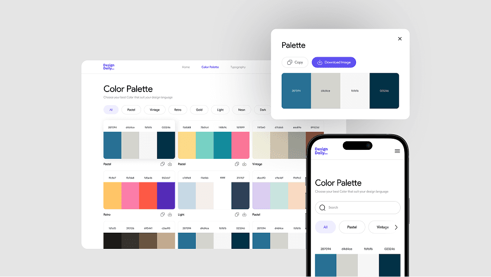
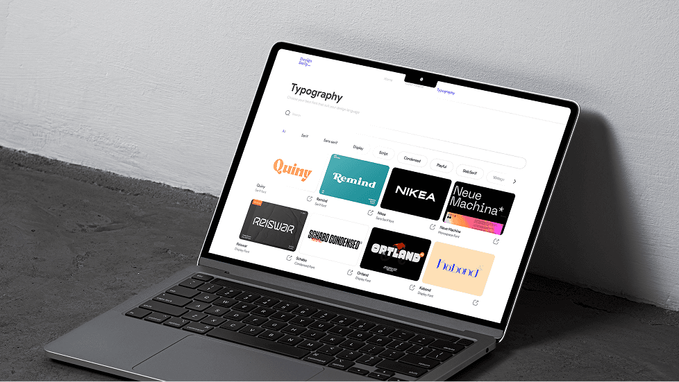
Provide a structured, daily design challenge to help users practice core UI/UX skills like layout, typography, and color theory.
Build a space where designers can share work, receive feedback, and grow together.
Help participants turn daily tasks into strong portfolio pieces that showcase their skills and growth.
Brand Discovery
To design a platform that truly supports aspiring designers, we began by understanding their core struggles — lack of structure, limited feedback, and difficulty building a portfolio. We explored how habits form, what keeps people creatively engaged, and how community support accelerates growth. The insight was clear: Designers don’t just need inspiration — they need direction, practice, and a sense of progress. This understanding shaped everything from the brand’s tone and visuals to how challenges are delivered. The result is a brand that feels motivating, approachable, and purpose-driven.
Logo and
Identity Design
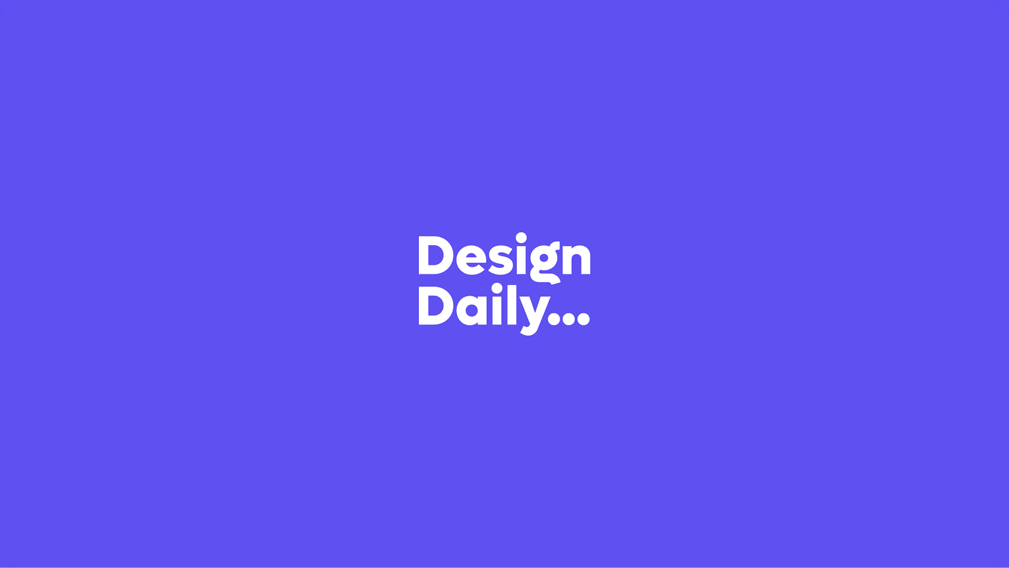
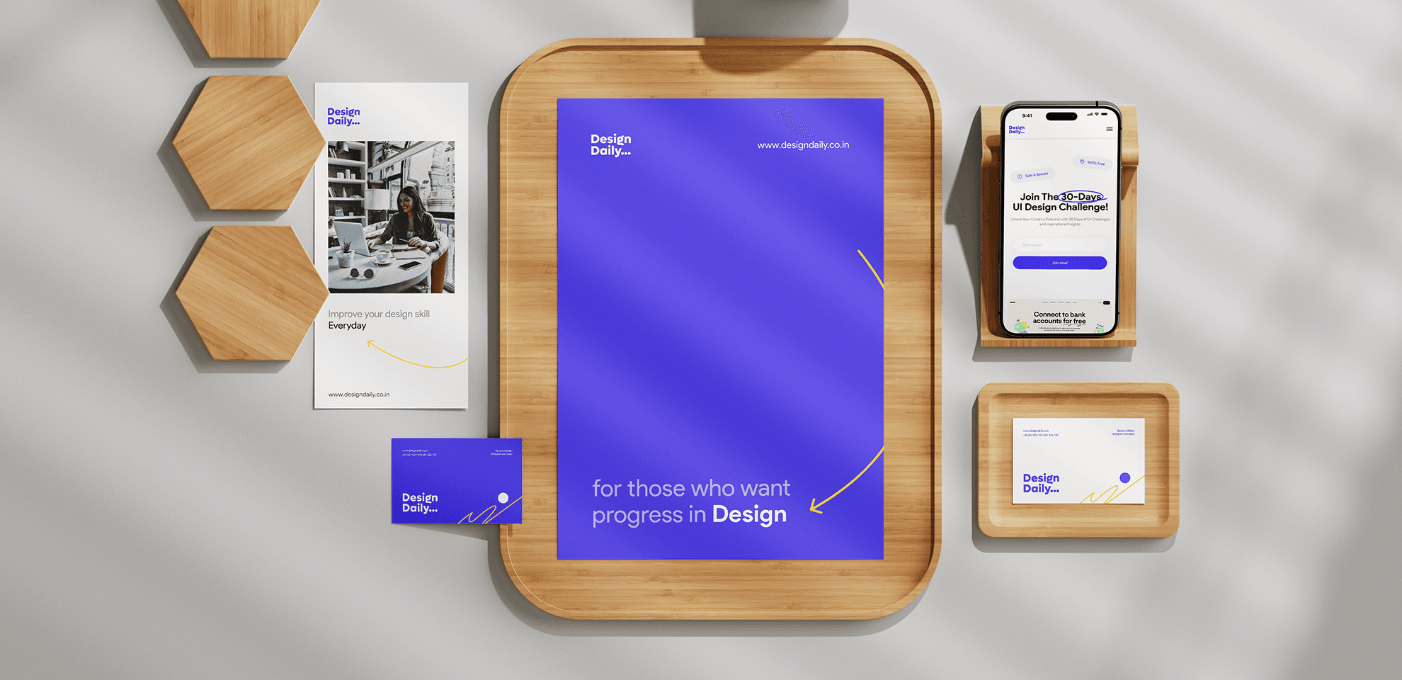
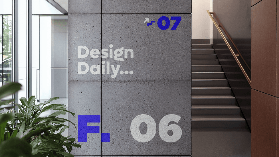
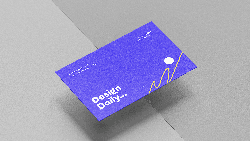
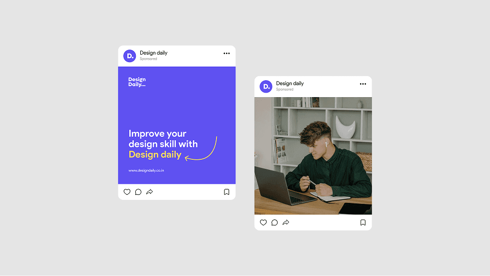
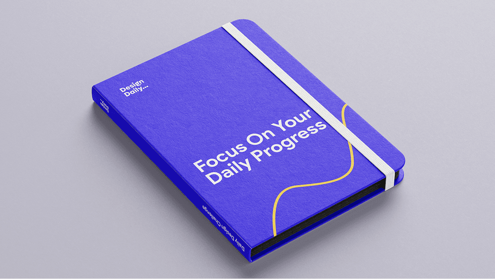
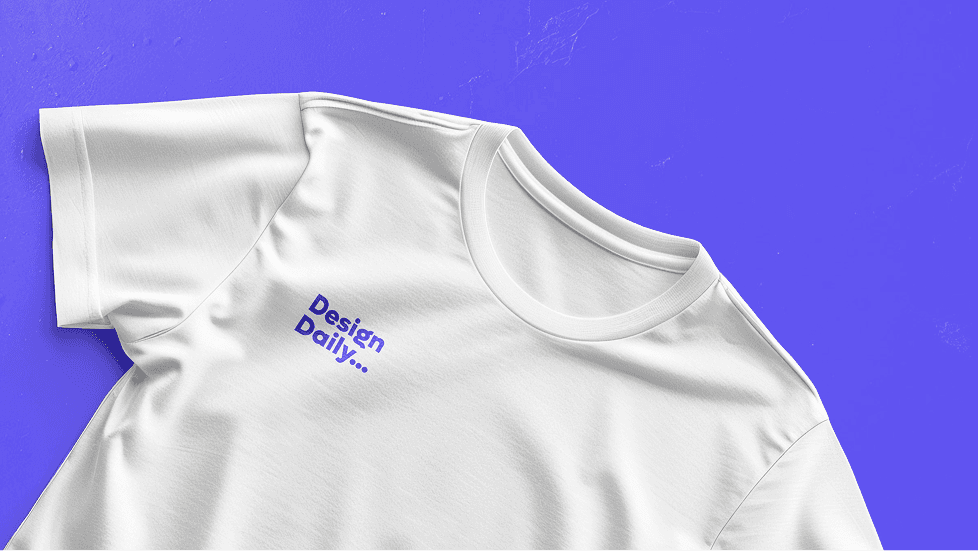
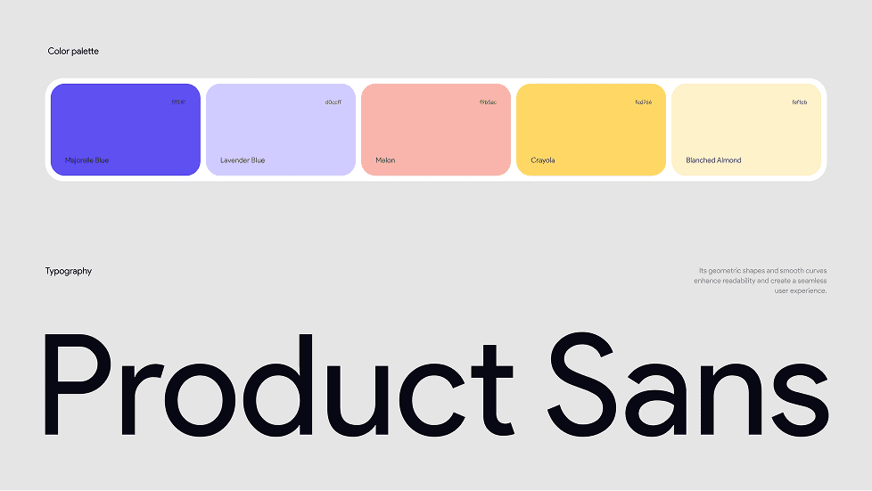
The Design Daily logo captures the spirit of daily progress and creative growth. Built around a simple wordmark, the logo features a playful ellipsis (“...”) at the end — symbolizing continuity, momentum, and the idea that design is a never-ending journey. The typography is bold and rounded, making it feel approachable, friendly, and supportive — just like the platform itself. The visual identity uses a vibrant color palette with energetic tones like Majorelle Blue and Crayola Yellow to evoke creativity, trust, and motivation. These are balanced by soft, calming pastels that keep the overall look fresh and welcoming. Every visual element, from the curved letterforms to the inviting colors, is designed to reflect the brand’s mission: helping designers stay consistent, feel confident, and grow through practice.
UI/UX Design
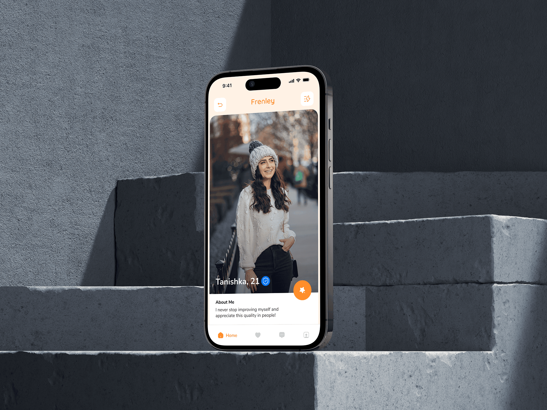
The stylescape for Frenely captures the essence of playful dating through bold visuals, vibrant colors, and a humorous tone. With a bright palette of orange and blue, quirky icons, and casual typography, the look feels young, energetic, and adventurous. It reflects the brand’s voice—fun, open, and full of good vibes. The imagery, conversational UI elements, and character illustrations together build a sense of community and modern dating culture. Everything is designed to attract singles who want more than just swipes—those looking for fun, vibes, and connection. It’s not just a style—it’s a personality in motion.
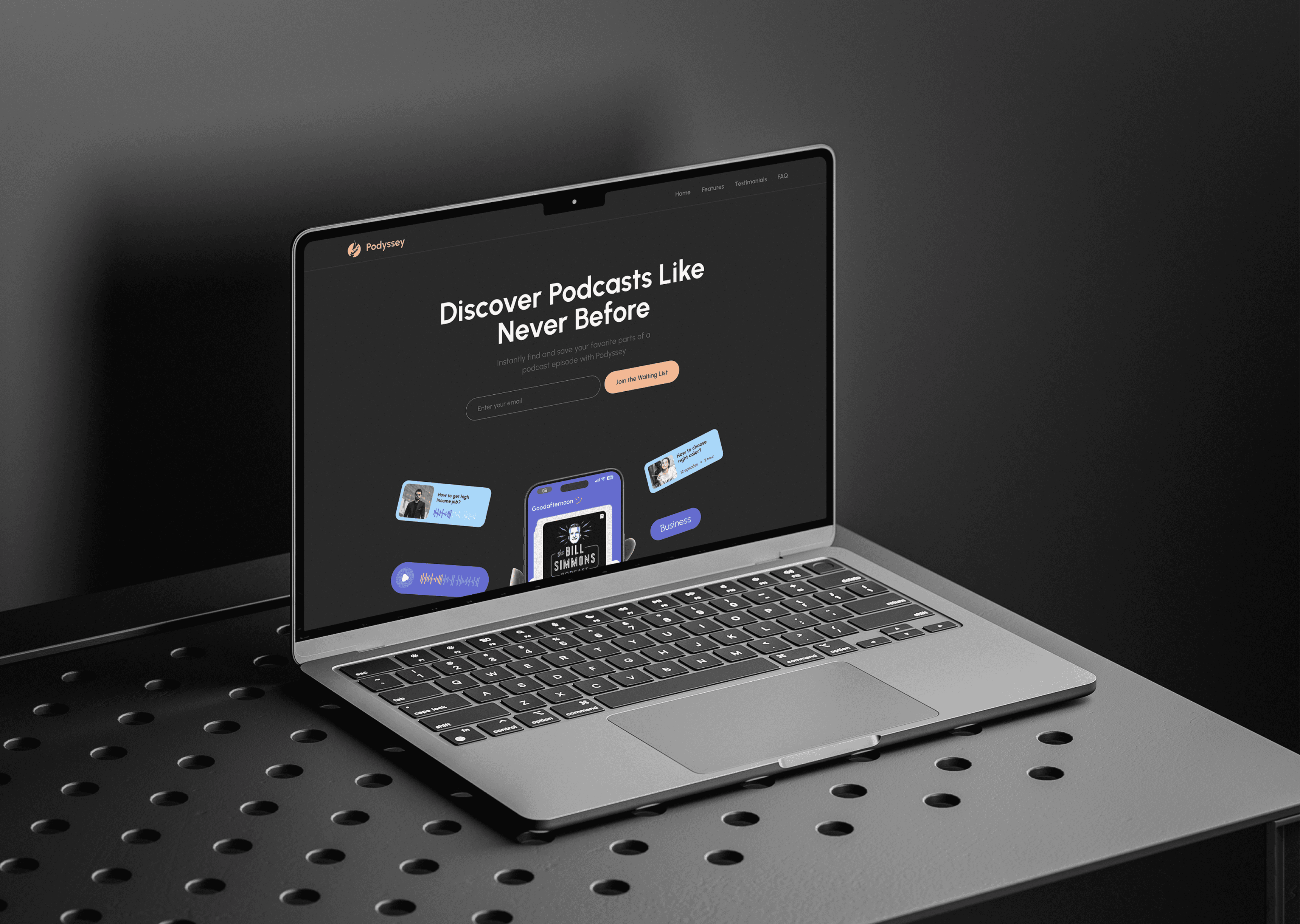
(Design Inspiration)


